What Is Chartjunk? [Visual Imagination #2]
Recently I wrote a wiki page listing all the benefits of installing Internet access in LDS meetinghouses. After I published my list, I realized the page was text heavy -- so much that it looked uninviting and intimidating, even though the content itself was good. You can view the avalanche of text here.
I like to think that text lays the foundation for graphics that will later follow. After all, you can't create a graphic without knowing what you want to say.
But now that the foundation is laid, I find myself wondering how to bring more appeal to the page through visuals and illustrations. I want to add visuals, but I don't want the visuals to be meaningless imagery that only serves to balance out the text.
Edward Tufte and Information Design
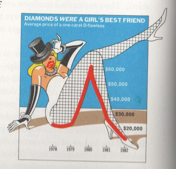
This dilemma brings me to Edward Tufte. In one of Tufte's classics on information design, Envisioning Information, he explores various principles of information design and how they play out in charts, graphs, and other illustrations across cultures and time. Early on in the book (the book is beautiful, by the way -- something you'd want on a coffee table in your living room), Tufte comes down hard on "chartjunk." He shows the following illustration:

He then says,
Consider this unsavory exhibit at right--chockablock with cliché and stereotype, coarse humor, and a content-empty third dimension. It is the product of a visual sensitivity in which a thigh-graph with a fishnet-stocking grid counts as a Creative Concept. Everything counts, but nothing matters. The data-thin (and thus uncontextual) chart mixes up changes in the value of money with changes in diamond prices, a critical confusion because the graph chronicles a time of high inflation.
Lurking behind chartjunk is contempt both for information and for the audience. Chartjunk promoters imagine that numbers and details are boring, dull, and tedious, requiring ornament to enliven. Cosmetic decoration, which frequently distorts the data, will never salvage an underlying lack of content. If the numbers are boring, then you've got the wrong numbers. Credibility vanishes in clouds of chartjunk; who would trust a chart that looks like a video game?
.... No matter what, the operating moral premise of information design should be that our readers are alert and caring; they may be busy, eager to get on with it, but they are not stupid. Clarity and simplicity are completely opposite simple-mindedness. Disrespect for the audience will leak through, damaging communication. What E.B. White said of writing is equally true for information design: "No one can write decently who is distrustful of the reader's intelligence, or whose attitude is patronizing. (Designing Information, pages 34-35).
In other words, chartjunk is superfluous visual imagery that serves no purpose in clarifying and displaying information. It is visual imagery for the sake of having some images, not for the sake of information visualization. Rather than clarify information, chartjunk competes with information and distracts the user with irrelevance. The irrelevance may even suggest the wrong ideas or inaccurate connotations.
I love Tufte's diatribe against chartjunk because it clarifies what information design is all about. You don't add illustrations to text just to give the reader a pretty picture. You show images to reinforce meaning. The visuals provide a framework for clarifying and displaying information that would otherwise be confusing.
Is the Standard Too High?
Let's return to the avalanche of text I mentioned earlier. The text covers 25 reasons to install Internet in a church, but my information isn't quantitative data or statistics. I could add pictures of meetinghouses and people acting in the various roles that I discuss, such as clerks and secretaries. But what purpose would these visuals serve, beyond merely breaking up the text with a picture to look at?
For example, I could add a picture of a man in a suit sitting in an office typing on a computer. That's the kind of image you're likely to see for this content -- pictures that somewhat fit the topic but fail to communicate any idea strongly. For example, here's one such image.

I haven't read enough Tufte to know if this would be in the same class as chartjunk. It's not a chart or graph; it's more like poster content. As such, Tufte might not have much to say about it at all. It's not information design. It is graphic arts, in the realm of posters.
But it seems to violate the kind of utilitarian philosophy with which I interpret Tufte, where all parts of a graphic or design work toward clarifying information. The image fails because these typing hands could belong to any Internet or workplace related content, and so it becomes generic and unenlightening.
There's something to be said for breaking up text with images, even if the images are superfluous. Some images inserted on a page of text might serve a formatting purpose: to reduce the mental strain on the user by balancing out text with graphics. But when possible, images should support the main concept of the article and illustrate that concept in a clear way.
A concept diagram differs from other graphics because it illustrates a specific idea; it's not just a vague image. In the case of my meetinghouse Internet article, the overall concept is that implementing Internet in a church building can improve the experience of just about every member and leader in a multitude of ways. There are 25 separate uses, not just one or two.
A clever concept diagram could work, but would tend to become too targeted to a specific reason and not all 25. Instead of a concept diagram, an information mural might be a more powerful way to communicate the plurality of benefits. Information murals cover a wide landscape of concepts and scenarios in one overarching scene that shows how each part interacts with the others.
Overall, in selecting visuals to support text, we must be careful of adding an image for the sake of an image alone. Images should work to clarify and support the information we're presenting.
I'll talk more about information murals in the next series post.
About Tom Johnson

I'm an API technical writer based in the Seattle area. On this blog, I write about topics related to technical writing and communication — such as software documentation, API documentation, AI, information architecture, content strategy, writing processes, plain language, tech comm careers, and more. Check out my API documentation course if you're looking for more info about documenting APIs. Or see my posts on AI and AI course section for more on the latest in AI and tech comm.
If you're a technical writer and want to keep on top of the latest trends in the tech comm, be sure to subscribe to email updates below. You can also learn more about me or contact me. Finally, note that the opinions I express on my blog are my own points of view, not that of my employer.

