A Paradox of Navigation Metaphors for the Web
In Ambient Findability, Peter Morville has an interesting observation about visual maps. He notes that we use a lot of physical wayfinding metaphors for the web -- we go to a page, we follow a path, we search for objects, we become lost, we use breadcrumbs to orient ourselves, we surf around, we use sitemaps, we design with blueprints, we practice information architecture, we navigate around, etc. These are all metaphors for using the web. All of these terms are borrowed the space of the physical world.
But here's the paradox. Although we use physical metaphors to describe how we "navigate" the web, most sites that use physical metaphors as navigation fail. Morville writes,
... Attempts to map the Web using information visualization techniques mostly fail. Over the past decate, there have been a number of well-financed efforts to solve search and navigation problems with interactive maps. These companies and their products ... enjoy tons of media coverage because their pretty pictures and futuristic visions attract attention. They are held up as a revolutionary step forward in human-computer interaction. They are the Next Big Thing. And then they disappear. (p.38, Ambient Findability)
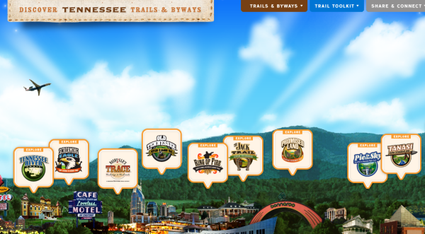
Recently Smashing Magazine featured a post on creative navigation techniques. Among them is a perfect example of what Morville talks about. Check out Tennessee Trails and Byways. On the site, you find information by clicking buildings on the map.

The Smashing Magazine authors explain:
Discover Tennessee Trails & Byways incorporate a “trail viewer” navigation for their users. The designers of the site use the same idea of horizontal scrolling navigation with a Parallax animation, but they decided to explain to users first how to use the navigation on the site. Usually, this is not a sign for an effective navigation, but it works quite well in this example, especially because the overall design appears to be very novel, playful and experimental to users anyway. In the case of uncommon or particularly innovative design techniques, this kind of instruction might be necessary until users understand the paradigm of the new navigation pattern.
The site is novel and fun to play with, but the fun soon wears off and becomes somewhat tedious as a means of finding information. This demonstrates the paradox with navigation metaphors: we use metaphors from the physical world as we describe our actions on the web, but those metaphors fail if you actually use them to build the navigation.
About Tom Johnson

I'm an API technical writer based in the Seattle area. On this blog, I write about topics related to technical writing and communication — such as software documentation, API documentation, AI, information architecture, content strategy, writing processes, plain language, tech comm careers, and more. Check out my API documentation course if you're looking for more info about documenting APIs. Or see my posts on AI and AI course section for more on the latest in AI and tech comm.
If you're a technical writer and want to keep on top of the latest trends in the tech comm, be sure to subscribe to email updates below. You can also learn more about me or contact me. Finally, note that the opinions I express on my blog are my own points of view, not that of my employer.

