Guest post: 10 New Things to Love and Hate About Flare
The following is a guest review by Karen Rempel, a technical writer based in New York and Vancouver.
It's been over seven years since Tom wrote his review of MadCap Flare v3. Over the years, hundreds of writers and potential Flare users have consulted his review to decide whether Flare will suit their needs.
Flare is up to v11 now, and I recently embarked on a robust project that allowed me to use many of the Flare features. The project involved generating four role-based training plans in both PDF and web help format, ranging in length from 80 to 120 pages. Tom kindly agreed to let me write this guest entry for his blog to provide some current analysis of MadCap Flare.
Like Tom, I love Flare, and the love affair makes me view the weak points with indulgence—more so than with other software that has exasperated me from time to time! So this review may be slightly biased in Flare's favor.
8 New Things to Love
Obviously there are hundreds of improvements between v3 and v11. Since I haven't kept track from release to release, I'll just focus on the impressions I gathered using v10 and then updating to v11. There are great things in both versions that didn't exist when Tom wrote his review of v3.
I'm going to use a slightly different scoring system than Tom did last time, ranking the impact of a feature on a scale of 1 to 5, with 5 being most important. And then rating the success of the feature from 1 to 5 as well, with 5 being excellent and 1 being poor.
| Feature | Impact | Rating | Notes |
|---|---|---|---|
| 1. Tutorial videos | 5 | 5 | The tutorials are accessible from the Start Page, and are visually appealing, hip, fun, and easy to follow. I loved the jelly beans and references to Led Zeppelin! They provided an overview of many of the concepts and features in Flare that a new user would need to know about. |
| 2. Well-designed ribbon and user interface | 5 | 5 | Almost every tool I needed for content development is accessible on the Home and Insert ribbons. But if you prefer a leaner old-style menu and tool bar, you can change to that view. And there are also context-dependent toolbars at the top of the working window, Content Explorer, and Project Organizer. MadCap Flare should win an award for the usability, robustness, and appeal of the user interface. |
| 3. Keyboard shortcuts displayed in tooltips | 4 | 5 |
Some software designers seem to be moving away from keyboard shortcuts. I've watched many people working on computers, and newer users are completely mouse-reliant, even for things like copy and paste. For old-timers like me, the keyboard is the thing, and I appreciated the fact that the shortcuts are provided in tooltips. I made a handy cheat sheet on a post-it and speeded up my work time considerably.

|
| 4. Review packages make reviews easy | 5 | 4 |
I worked with a small team of reviewers, and we tested the usability of reviews with both Flare and Contributor. It's easy to select all or some files and send them out for review via email directly within Flare. The reviewer can make changes and easily send the review package back. Seamless and simple.
There was a small glitch integrating with Microsoft Outlook the first time I sent out a review package, but after that, easy-peasy. I suggest to users that they rename the review package with the reviewer's initials before importing it back into the project. |
| 5. Topics with review changes are easy to identify | 5 | 5 | The File Reviews window has sortable columns for quickly identifying which topics have changes or annotations, and also indicates if a topic has changed since it was sent for review. Nice when dealing with hundreds of topics and only a few changes! |
| 6. New Builds window for building projects | 3 | 5 |
This is one of the significant visible changes from v10 to v11. It took a bit of getting used to, but it is very handy, showing successive builds in a spreadsheet format, with a tracking bar for build progress, summaries of errors and warnings, and menu options at the top.

|
| 7. Publish directly to a website | 4 | 4 | You can specify a publishing destination, including ftp settings and url, and publish directly to the web. Once the web host has been set up, and you've set up the link to your help project, you can publish updates to the web with a single mouse-click. Sweet! |
| 8. Great templates including the new Top Navigation format | 3 | 5 | Tom's going to post a sample of this feature, because it's the hottest topic in Flare 11. [See the demo here.] You can publish your web help in a gorgeous responsive web design with top navigation menus. The default template design is beautiful and robust, allowing you to get a new website up and running with very little customization. |
Total score on the love scale: 156 points!
2 New Things to Hate
No software is perfect, and MadCap Flare is no exception. Here are a couple things that are quite annoying.
| Feature | Impact | Rating | Notes |
|---|---|---|---|
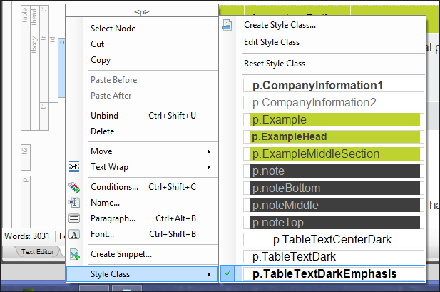
| 1. Bottom item in context menu flashes and is hard to select | 5 | 1 | This is a real pain, trying to click the bottom menu item when it was at the right stage of the flashing cycle. Buggy.
|
| 2. Can't use cross-references in footers | 3 | 1 | My client's original design had a link to the table of contents page (topic) in every footer. I was unable to replicate this in MadCap Flare. I even tried coding the cross-reference link directly in the html code, but it doesn't work. I guess because the footer is in a page layout, and the page layout is applied to topics. So it can't refer to a topic because it might be referring to itself? I reported this limitation to MadCap Flare as a bug. |
Total score on the hate scale: 8 points! So love wins the day. I warned you!
An Update on Tom's 45 Loves and 31 Hates
These tables provide an update on Tom's previous analysis, showing which features are still great, which are no longer useful, which issues have been fixed, and which still remain.
Love About Flare
As you'll see, I determined that a few items are now moot, two items are no longer lovable (if they ever really were!), and the rest are still good in my opinion.
| Feature | Still Good | Moot | Notes |
|---|---|---|---|
| 1. Clean Word output |

|
Output to PDF is more useful. I also found that there were too many irritating issues outputing to Word, including problems with headers, footers, and tables. | |
| 2. Index words embedded mid-topic |

|
I don't know if anyone uses an index anymore. While useful for printed books, most output these days is online and therefore completely searchable. | |
| 3. Cross references |

|
Highly customizable. Even accommodates references to autonumbered headings. Just be careful of the coding when applying condition tags. Check in the Text Editor. | |
| 4. Persistently open style pane |

|
You can also apply styles using the Home ribbon and by right-clicking the relevant block in the left margin.

|
|
| 5. Drop-down twisties |

|
Still great! And super easy to add from the Insert menu. | |
| 6. Thorough integration of CSS standards |

|
And now HTML 5 - the latest web standard. | |
| 7. Multiple mediums for stylesheets |

|
In a Flare webinar I attended, they showed another cool use for mediums: define a medium that shows the edges for borders, padding, and margins, so you can see whether you've got the results you intended. | |
| 8. Lists functionality |

|
Lists work well (with the output appearing as it is supposed to, unlike the still-buggy Word lists), and are fairly straightforward to use. However, I found the need for some knowledge of CSS and direct coding in the Text Editor at times. | |
| 9. Flawless display in both Firefox and Internet Explorer |

|
And Chrome too. |
|
| 10. Mix-and-Match ability with targets, TOCs, and stylesheets |

|
Still awesome! Together with condition tags and variables, this is what makes Flare the robust tool it is. | |
| 11. Open-and-close speed with topics |

|
Yup. Super fast. | |
| 12. Drop-down text |

|
||
| 13. Automatic updates of changed file names and locations |

|
Zowie! It's great to have the option to choose whether or not to update the links, too.
The only problematic area was condition tag names in targets. Flare didn't know how to remove deleted condition tag names. It left them behind in the target and I had to manually delete them in the text editor. |
|
| 14. Breadcrumbs |

|

|
|
| 15. Editing index entries |

|
||
| 16. Interface flexibility |

|
Great design. I think this is one of the reasons I love Flare so much. | |
| 17. Active user forum and knowledge base |

|
I too found this a very helpful source of information. When the Flare help was silent, I discovered that other users had often encountered a similar issue and could point me in the right direction. | |
| 18. Printed output intelligence with headings |

|
I didn't use Word output. This feature didn't seem relevant with the PDF output I generated. | |
| 19. Madcap's company size and focus |

|
Seven years later, the people at MadCap are still friendly, responsive, and happy to help. I spoke to several people during the course of the project, and they helped with all questions and appreciated feedback on improving the product. | |
| 20. Shortcut for editing images |

|
I use Corel Paint Shop Pro Photo, and I was able to edit images by right-clicking and selecting this tool. Changes appear automatically wherever the images have been used in the project. I could even go back into Paint Shop Pro, undo the change, and this was updated as well. Slick!

|
|
| 21. Windows Explorer Integration |

|
Fantastic. | |
| 22. Styles for drop-down heads |

|
||
| 23. Accordion stacking and organization of content |

|
I agree with Tom, the organization of the Content Explorer and Project Organizer is very intuitive and easy to use. | |
| 24. Content Explorer filter |

|
The options in the Content Explorer toolbar have perhaps grown since v3, and the Filter is still there too, though I didn't use it. I do find the Collapse All tool helpful.
 |
|
| 25. Flare's online help |

|
For beginners, the help is a great resource that aids in learning the basics. I found it less useful for more advanced problems, but as mentioned above, the User Forum often pointed me in the right direction. | |
| 26. Detachable tabs |

|
The detachable (floating) tab feature is also useful when working with reviews. It allows me to have the review copy of a topic open and make select changes in the original topic file. | |
| 27. The robustness of the tool |

|
I was able to replicate almost all of the design elements of a document produced in Adobe InDesign. Not only does Flare have state-of-the-art content management capacities, but also extremely complete design capabilities, autonumbering, and other complex features that software such as Word doesn't do nearly as well after many more years in the marketplace. | |
| 28. Collapse, expand, and print buttons in the Webhelp toolbar |

|
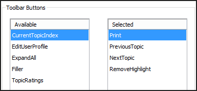
There is now a much wider choice of buttons for the Webhelp toolbar. You can also assign custom JavaScript to buttons on the toolbar.
|
|
| 29. Intelligent cursor behavior |

|
?? Not sure what Tom means by intelligent cursor behavior. The cursor seems to work as expected most of the time with regular text, but is difficult to work with in master pages, and in tables it can sometimes be difficult to select the desired text. The positioning of the cursor is not quite aligned with WYSIWYG, and it can be very frustrating at times. | |
| 30. CSS editor filter |

|
||
| 31. Smart index keywords based on TOC builds |

|
As per my previous comments on indexes, I think this is moot now, but it is a very useful aspect if you are still designing print books with indexes. | |
| 32. Error log when generating output |

|
Very helpful | |
| 33. Perceived lack of company bureaucracy |

|
The folks at MadCap Flare are very helpful and responsive. I too found that someone called to ask if I have questions and offered support and access to webinars. | |
| 34. The mysterious-looking structure bars |

|
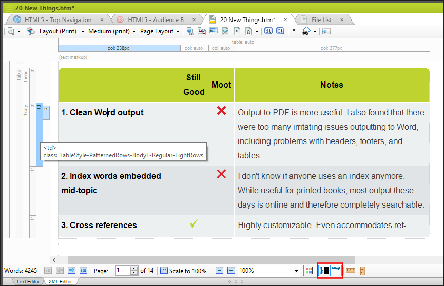
The blocks at the left and span bars at the top provide a very handy way to view information and select page elements to manipulate. You can toggle the display of the blocks and spans off and on.
|
|
| 35. Internal text editor |

|
Very helpful. You can use this editor to edit any file, including target files, master pages, skins, css, and so on. I use it all the time. | |
| 36. Absence of erratic spacing in the Webhelp output |

|
Flare usually strips away extra spaces. You can manually add multiple spaces in the Text Editor using . Occasionally when working with lists in XML Editor view, Flare inserts this character sequence: . It is not displayed in the output, but occasionally the sequence causes an extra unwanted line break to appear between paragraphs. | |
| 37. Real rather than virtual folders |

|
I love this too. All folders for the project are kept in one place, not hidden away in My Documents, Libraries, Application Data folders, or other mysterious locations. Plus, all files in Windows Explorer are in the same folders and order as in the Content Explorer. A+ for this! | |
| 38. Conditional tagging functionality |

|
Another A+. | |
| 39. Mark of the Web |

|
||
| 40. Image resizing |

|
There are multiple ways to resize images, including dragging. However, the dragging doesn't work so well when the edge of the image is off the edge of the page. | |
| 41. Table styles |

|
Still a bit unpredictable in how the table styles from the Table Editor override styles in the CSS, but the help does try to explain the precedence rules. I found that if I applied formatting in the Table Editor, I could override some features by adding a new style to the CSS. But if I opened the Table Editor again, it overwrote the style in the CSS. In general, I would say avoid the Table Editor. | |
| 42. Smart printing of online topics |

|
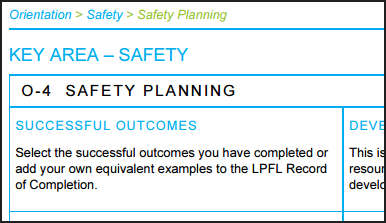
This works differently than v3. The screen medium is used, but the layout is formatted attractively and includes the breadcrumb, which is helpful for future reference to find the online topic again.
|
|
| 43. Adding Related Topics |

|
Easy-peasy. It took five seconds to add this:

|
|
| 44. Full skin previews |

|
||
| 45. Conditional table selections |

|
Beautifully done. |
Hate About Flare
There were a few items Tom mentioned that I didn't test in my work in Flare, so there are a few question marks below.
| Feature | Still Bad | Fixed | Notes |
|---|---|---|---|
| 1. Can't create cross references to bookmarks in drop-down heads |

|
I didn't test this feature. | |
| 2. Confusing table styles |

|
See 41 above. The help does discuss the issue, but it's still confusing. | |
| 3. Ambition without completion |

|
I would say many things have been fixed in the past 8 releases, but without specifics of the bugs Tom was referring to, I don't know for sure. The many fine features described above make Flare seem like a complete, well-designed, fabulous product. Flare does offer a screen capture tool (MadCap Capture), which I never used. You can also insert various types of video files including embedded YouTube and Vimeo videos. | |
| 4. The deceptive Quick Search field in Webhelp |

|
The Search feature now searches the entire project. | |
| 5. The learning curve |

|
I used the tutorials to get an introduction to key features and felt fairly adept at using Flare within a week. | |
| 6. Poor Webhelp toolbar graphics |

|
This is a matter of taste. I like them! | |
| 7. No labels for Webhelp toolbar buttons |

|
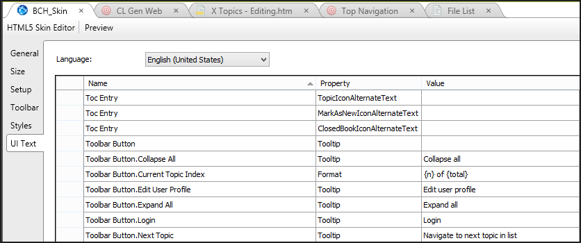
You can specify custom tooltips in the skin.
|
|
| 8. Quirks with deleting things |

|
See 13 above. I also had trouble removing character level formatting and had to use the Text Editor to do it. | |
| 9. Abundance of unfriendly error messages |

|
I didn't notice any error messages as I was working, except the error log that Flare creates when I build a target. | |
| 10. Lack of integration with Captivate/Camtasia |

|
You can now import Flash and other formats using the Multimedia button on the Insert menu. | |
| 11. The unintuitive, weird cursor |

|
See 29 above. | |
| 12. Lack of pixel size information for images |

|
You can specify and view the resized pixel dimensions in the Image Properties dialog box and in the Text Editor view. However, for the original dimensions, you'll have to go to your graphics tool or Windows Explorer. | |
| 13. The learning curve | See 5 above. | ||
| 14. Lack of instruction about the MiniTOC |

|
The help topic for using mini-TOCs has been updated and expanded. | |
| 15. Assumptions about my understanding of CSS |

|
There's a help topic on "Ways to Use CSS." In addition, one of the webinars I attended has info on how to style a note or tip. Tom spoke and the folks at Flare listened! | |
| 16. Absence of drag-and-drop functionality for proxies (setting up page layouts and master pages) |

|

|
You can now set up first, left, right, main, and more pages for a page layout, making it easy to set up the different footers required for each page type. Similarly, for master pages you can specify odd, even, first, and more. However, you can't drag and drop the proxy. You must use the Text Editor to view the coding for proxies.

|
| 17. Conditional text seems flaky |

|
I found I could create incredibly complex combinations of links and conditional text with no issues. But if in doubt, check the Text Editor view to see what the coding is doing. | |
| 18. Can't have the stylesheet simultaneously open in Dreamweaver |

|
I didn't test this feature. | |
| 19. No public tracking of my bug submissions |

|
To my knowledge this is still the case. They have a very robust interface for submitting bugs though! | |
| 20. Confusing stylesheet commands for cross-references |

|
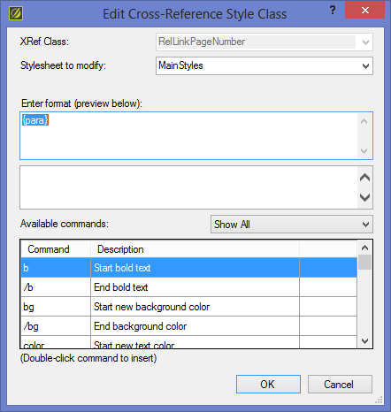
They have now added the parakeet text string. (Kidding.) I found it easy to add and edit style classes for cross-references, right in the cross-reference dialog box. I could then make edits directly in the CSS (in the Text Editor). Very robust.
|
|
| 21. Incorrect WYSIWYG display for printed styles |

|
I didn't notice any problems with this. | |
| 22. TOC centering quirk in navigation pane |

|
Now the long entries are cut off at the right. So the centering bug does not occur. But Flare doesn't wrap the text to the next line. | |
| 23. MadCap Analyzer is a separate product |

|
I agree with Tom, I'd like to see this product included with MadCap Flare. The option to test all external links is only available in MadCap Analyzer, but it's basic functionality that should come with Flare. | |
| 24. The CSS Style Editor |

|
The design issues Tom spoke of are still present in v11. I found I ended up using a combination of each possible view of the Style Editor, as well as edited the CSS in the Text Editor. I usually had both editors open at once. | |
| 25. The term “proxy” |

|
The term is still there, and thanks to Tom's blog, I knew what it was and what to look for! | |
| 26. Ability to cripple your project |

|
This is still a possibility when using global search and replace in the source code. There is a warning before executing the S&R, but it is possible to render numerous topics unopenable with no indication this has happened. I did this twice, and found that topics in the TOC just didn't appear in the output. Scary! | |
| 27. Selecting one topic at a time in the Content Explorer |

|
||
| 28. Lack of keyboard controls |

|
Ctrl-Backspace now deletes the word in front of the cursor. | |
| 29. No quick code view tab |

|
I've frequently mentioned the Text Editor, and it is available at the bottom of the window. It's possible to quickly click Text Editor and XML Editor to go back and forth between code view and WYSIWYG view. Text now wraps in the Text Editor view. | |
| 30. Silent failures for printed targets |

|
If you corrupt a topic file as discussed in 26 above, the topic won't be included in the generated target. | |
| 31. Too many search results from the help file |

|
"Saving files" now returns 1,211 results! I would add another complaint about the help, because sometimes it is painfully slow to return the list of results. |
About half of the things that Tom hated about MadCap Flare have been fixed. Not bad!
About Karen Rempel
 Karen Rempel is an experienced New York and Vancouver-based technical writer. She was the president of the Canada West Coast chapter of the Society for Technical Communication and has won several Pacesetter awards for contributions to the profession.
Karen is passionate about MadCap Flare and is an Esalen massage practitioner. For more information, see Karenrempel.com.
About Tom Johnson

I'm an API technical writer based in the Seattle area. On this blog, I write about topics related to technical writing and communication — such as software documentation, API documentation, AI, information architecture, content strategy, writing processes, plain language, tech comm careers, and more. Check out my API documentation course if you're looking for more info about documenting APIs. Or see my posts on AI and AI course section for more on the latest in AI and tech comm.
If you're a technical writer and want to keep on top of the latest trends in the tech comm, be sure to subscribe to email updates below. You can also learn more about me or contact me. Finally, note that the opinions I express on my blog are my own points of view, not that of my employer.

