"You know what .chms need? More bling-bling. More flash..."
Last week Kristi Leach wrote a tweet about the need for help to transform into a more attractive format:
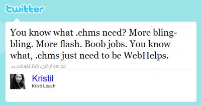
Her tweet expresses what I've been feeling for a long time. There's a massive rift between content online and content in help files. In most help files, the content is static, old, textual, boring, unhelpful, sometimes obvious, or irrelevant, never packed with eye-candy, video, or any human element. It could exist inside medical packaging. IE's help provides a perfect example:
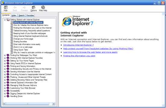
The world online, on the other hand, is more appealing, more full of multimedia, more interactive and eye-catching. Is it any wonder why people first turn to Google rather than an application's help file?
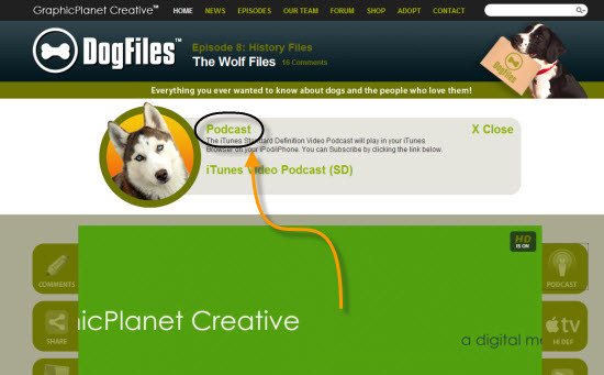
For an example of a website with flash and bling, I refer you to The Dog Files. I'm not a fan of dogs (although after watching Bolt at the dollar theater last night, most of us wanted a dog). Instead, I heard about The Dog Files site on a WordPress podcast with Jeffro (episode 33), who interviewed the site developer and producer.
The Dog Files is a custom WordPress site that displays rich media in a unique way. The heart of the site is a video screen, similar to a TV that you flip on. Immediately you know the site has an entertainment component as its focal point.
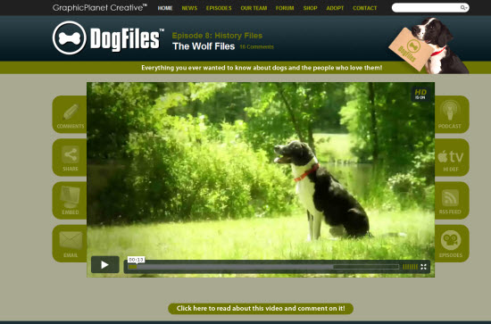
Navigation buttons conveniently span around the video player. When you click the Episodes button, rather than seeing a plain list of titles, you see thumbnails next to each image along with a short summary of the content.
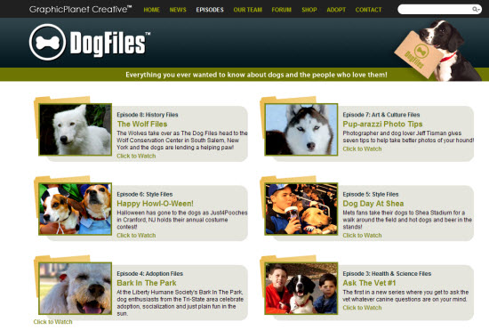
The Shop, Blog, and Forum features are directly integrated into the site, making it one seamless experience. The user doesn't have to navigate separate sites linked together.
You can interact with almost every page by commenting on both blog posts and videos -- without having to log in. (However, you can log in directly in the comment form if you want.)
You can also share the videos easily (they use Viddler) as well as subscribe to the video podcast in iTunes. In other words, the media isn't trapped in the site, but can be easily shared on your own blog, where you can expand on the concepts, or you can download it to your iPod, where you can watch it wherever you want.
I'd like to package help into a site like this. Granted, the team that created this site has serious PHP/WordPress and video skills. Also, I recognize the limitations of this site with translation, budgets, and time constraints. Still, how cool it would be! I see similar sites like WordPress.tv and Adobe.tv and it makes me feel excited about help. It changes all the previous attitudes about help being useless, unhelpful, and boring.
To produce such a site, you have to expand your skillset, but not too much. With a little web design, screencasting, and audio skills and you can put together something like this. Those aren't so much the challenges I face right now as much as infrastructure limitations (my IT department doesn't support PHP). I'm also in an intranet rather than web environment. Still, this is the direction to go.
About Tom Johnson

I'm an API technical writer based in the Seattle area. On this blog, I write about topics related to technical writing and communication — such as software documentation, API documentation, AI, information architecture, content strategy, writing processes, plain language, tech comm careers, and more. Check out my API documentation course if you're looking for more info about documenting APIs. Or see my posts on AI and AI course section for more on the latest in AI and tech comm.
If you're a technical writer and want to keep on top of the latest trends in the tech comm, be sure to subscribe to email updates below. You can also learn more about me or contact me. Finally, note that the opinions I express on my blog are my own points of view, not that of my employer.
