About My New Site Redesign
12/9/09 update: I changed it back.
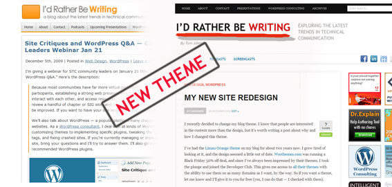
I recently decided to change my blog theme. I know that people are interested in content more than design, but it's worth a post explaining why I changed this theme.

I've had the Limau Orange theme on my blog for about two years now. I grew tired of looking at it, and the design seemed a little out of date. Woothemes.com was running a Black Friday 50% off deal, and since I've always been impressed by their themes, I took the plunge and joined the Developer Club. This gives me access to all their themes with the ability to use them on as many domains as I want. By the way, if you want a theme, let me know and I'll give it to you for free (yes, I can do that -- I checked with them).
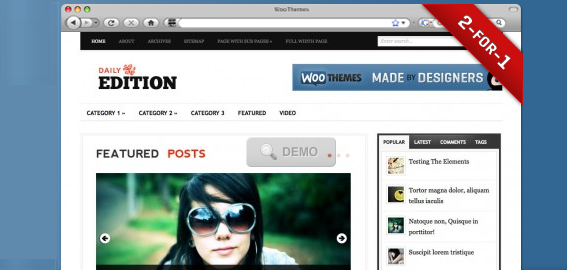
I narrowed my choices down to several themes and then let my daughter, who gives excellent advice, decide. She chose the Daily Edition.
Part of the appeal of the Daily Edition theme is the Flash slideshow on the home page. This slideshow makes the otherwise minimalist theme stand out. It's eye candy, basically. And though at times it feels like a neon sign, it forces me to include visual elements where normally I might omit them out of laziness.
Embedding a slideshow at the top of your posts, by the way, is not hard at all. Just install the Featured Content Gallery plugin, add a snippet of code to your index.php file, and voila, you have a slideshow. This is the same feature I have on the Intermountain STC site.
Another thing I like about the Daily Edition theme is the readability of the font. The main column isn't too wide, the font is readable, and it has a good amount of white space.
I would like to say the theme required no customization. But that's not true. I had to restyle the blockquotes on the home page to match the blockquote style on the single pages (the blockquote style is a little grandiose, I think). I fixed the display of widgets in the sidebar (particularly the excessive padding with the headings), added multiple subscribe buttons on the main navigation bar (which required an adjustment to the stylesheet), changed the list of links below the latest posts (initially these were called "Talking Points" and were driven by tags), created a single post template for my screencasts category and widened it to accommodate a larger screencast size. I added more ad spaces, integrated my logo, customized the display of the Publish2 Technical Communication newsgroup links, rearranged the tabber and customized the tab's PHP code, and added a truncation script to the slideshow text (because two lines in a title broke the display).
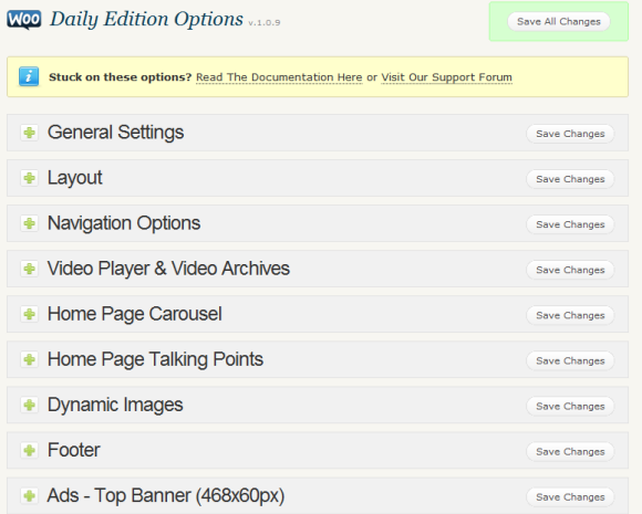
The themes at Woothemes, I have to add, have more complicated code. The designers try to create elaborate interface options, like this:

As a result, the code that drives the interface options is more complex. I imagine this is an inevitable tradeoff: either have simple code and no user interface options, or lots of easy user interface options but complex code.
That's about it for the theme. If you have any suggestions for improving the design, please let me know.
About Tom Johnson

I'm an API technical writer based in the Seattle area. On this blog, I write about topics related to technical writing and communication — such as software documentation, API documentation, AI, information architecture, content strategy, writing processes, plain language, tech comm careers, and more. Check out my API documentation course if you're looking for more info about documenting APIs. Or see my posts on AI and AI course section for more on the latest in AI and tech comm.
If you're a technical writer and want to keep on top of the latest trends in the tech comm, be sure to subscribe to email updates below. You can also learn more about me or contact me. Finally, note that the opinions I express on my blog are my own points of view, not that of my employer.


