How do you establish more context in a topic-based writing model?
Background
Recently I attended an STC Silicon Valley presentation by two tech writers from Palo Alto Networks who spoke about how they constructed their documentation portal. The portal is a great example of doc portals, and one that you can learn a lot by studying. You can see their slides here.
While doc portals is a topic worth exploring in more depth, I had a question along a different line. I asked why they chose to minimize the number of topics in the table of contents and instead put more of the nav links within the main content view. For example, if you go to this page, you’ll see that the TOC navigation tree on the left is fairly minimal, but when you click a topic, there a number of sublinks to navigate.

I asked why they didn’t load up the TOC with all the topics, as is customary with tech docs. They said they wanted to preserve the context for the information. When you chop information up into little pieces, you lose the necessary context the user needs to understand the larger picture. This is often the problem with DITA-authored content – writers chunk the material in such a granular way that all context is lost.
I’ve written in the past about chunking and context (for example, see Topic Chunking and The Broken Alarm Clock). As I’ve been documenting a new project lately, I want to preserve the context for users in helpful ways.
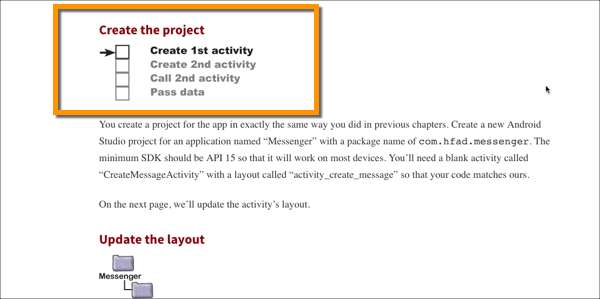
This topic also is on my mind because while reading Head First Android Development, I noticed how the writers continually presented a map to show you the larger view of the doc structure:

My attempt
So here’s what I tried doing to help establish context. While drafting the content, I tried to keep all the information in one long topic rather than a lot of little topics — just for the draft stage so that I could assess how all the information fit together.
By keeping everything in the same page, I could ensure proper flow from topic to topic — or so I hoped. After about 7,000 words, though, the topic simply got to be too unwieldy to navigate, and at that point I divided it up into about 15 separate pages.
It was helpful to keep everything on one page for initial draft. When I start out writing, I don’t know exactly what the shape of the doc will be. But by the time I hit about 7,000 words, I usually know where the dividing lines needed to be drawn.
This approach actually saved me a bit of time. I was not constantly changing file names and organization so much as with other approaches.
But still, my initial attempt was to approach tech doc authoring in a way that preserved the necessary context that readers need — context that is often lost when you break apart your content into a thousand separate tiny topics. Now that I’ve split this one up into 15 pages, have I lost some of the context?
Yes, any time you start dividing content onto separate pages, you fragment the information. Users can start anywhere in your doc, and there’s no easy way to hold their hand through the right order. With this loss of order, context takes a hit and the documentation is harder for users to follow.
Another solution
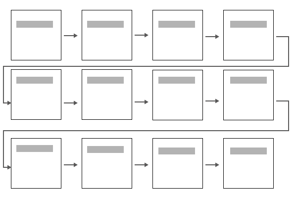
As another solution, I’m trying to add a workflow diagram that shows the essential path through the content. I want to put this workflow diagram on each of the pages where I expect users to perform the task as part of a sequence of topics. Here’s the worfklow:

For users who are going through a beginning-to-end process and following a series of files through your overall content, this map might be helpful. Without it, users could jump randomly around in your help content (which may be necessary given their needs).
This map is too bulky to add at the top of each page, so I’m looking at different ways to show it. Maybe a thumbnail that zooms into a larger view?
Next steps
The other challenge is that I want the graphic to be an SVG graphic so that I can edit the text and hyperlink the boxes to the appropriate page. I also want to add unique style to each element and highlight that element to be another color when the user is viewing the page. This would allow me to use the same SVG instead of duplicating it into 15 variants.
About Tom Johnson

I'm an API technical writer based in the Seattle area. On this blog, I write about topics related to technical writing and communication — such as software documentation, API documentation, AI, information architecture, content strategy, writing processes, plain language, tech comm careers, and more. Check out my API documentation course if you're looking for more info about documenting APIs. Or see my posts on AI and AI course section for more on the latest in AI and tech comm.
If you're a technical writer and want to keep on top of the latest trends in the tech comm, be sure to subscribe to email updates below. You can also learn more about me or contact me. Finally, note that the opinions I express on my blog are my own points of view, not that of my employer.

